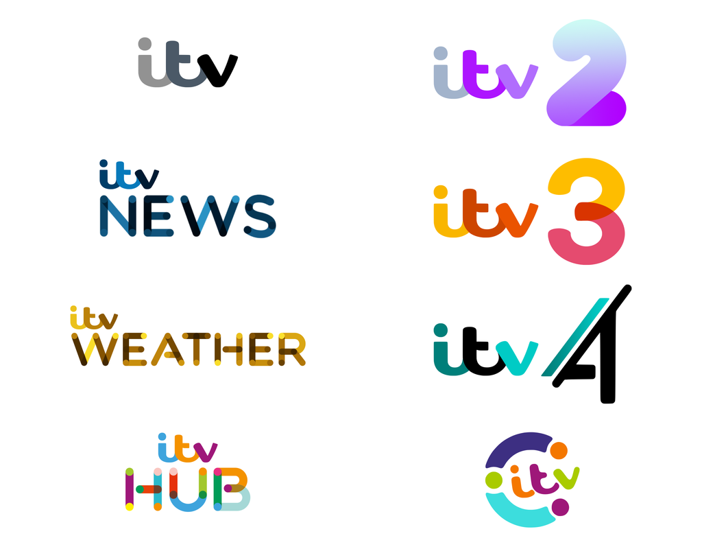
Thanks for all the feedback. I've further revised the logos and here's where I've got to:
The main ITV logo has a tiny touch of colour, tinting the 't' to a grey-blue. As I said before, on the main channel the logo would be constantly colour-adapting the content it surrounded, so this version would only be seen in print or online, or whatever, as the corporate logo.
ITV3's numeral has been rounded to better suit the curvature of the ITV logo. ITV4's slant has been adjusted to make it look less like an 'A'.
And CITV has been reworked to differentiate it more from ITV Hub, and harks back to the 1998-2006 style. Also added an ITV Weather logo.
Not sure why the logos have to have dots throughout them and different shades of the same colour throughout, it just looks weird and very out of place for News and Weather. It seems fine for Hub if a little busy. The ITV 2 one is nice but the 2 is a little chunky, I would make it a bit slimmer
That Weather one's not ideal. You've got yellow next to dark brown. It's not going to be properly visible on light OR dark backgrounds There's always going to be bits that are lost.
Citv looks great though. Little touches like the kid-friendly rounded nature of the 'itv' makes it a very good fit for the channel and its audience.
I appreciate the point of view about them looking too 'childish' but I would seek to ensure the surrounding graphics packages overcame this concern. I'm going to give a stab at these graphics soon I think. The idea is for the logos to be round, friendly and 'cuddly' in a way, but that's not to say the complementary graphics would also follow this ethos.
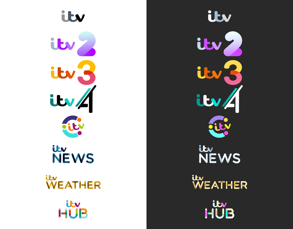
Regarding visibility on darker backgrounds, the logos would have alternative versions for this use case, and a further version (probably more 'block colour') for use on top of imagery (which I could illustrate in future graphics ideas). I've also slightly tweaked the Weather logo so the darker brown is less harsh compared to the rest of the colours.
I appreciate the point of view about them looking too 'childish' but I would seek to ensure the surrounding graphics packages overcame this concern. I'm going to give a stab at these graphics soon I think. The idea is for the logos to be round, friendly and 'cuddly' in a way, but that's not to say the complementary graphics would also follow this ethos.
Regarding visibility on darker backgrounds, the logos would have alternative versions for this use case, and a further version (probably more 'block colour') for use on top of imagery (which I could illustrate in future graphics ideas). I've also slightly tweaked the Weather logo so the darker brown is less harsh compared to the rest of the colours.
I like the way the news and weather logos look on a black background. Although I think the colour you have used for the weather would fit ITV Studios more.
This is a nice exploration I would like to see refined and developed further. I agree with your thoughts on the ITV News colour scheme - the navy works extremely well.
I particularly like the chunky ITV2 numeral - lots of charm and character.
The comments regarding the Weather colour choice being problematic are fair and easily resolved.
It would be interesting to see a cohesive surrounding presentation style developed to see how it all fits together as a family of brands - like when the 2013 rebrand first launched.
I LOVE the CITV logo, I enjoyed the original but I just love that it’s been brought closer together and the simplified logo that’s wrapped up by the C, I always feel that CITV logos feel like an afterthought in the rebrands so it’s nice to see it feel like an actual brand again here. It’s interesting seeing the logos on the dark background, I like the Weather logo on the white but it doesn’t look as strong on the black, the News I feel has improved but I think when you look at from a distance it makes sense.
I still think while it may be a bit tamer, the News and Weather logos should be the font they are now without the colour gradients and the dot to dot. I think having Weather, Hub and News in the same style takes away from them. I know that you could say that it’s the family style but I think that the design is too bold to overuse and simplifying the two more serious brands may make Hub stand out a bit more? 3 I don’t see any need to change other than maybe experimenting with some other colours, I’m happy with the 2 but would be interested to see a slimmer version to get a sense of perspective.
I know you merged Be and 2 but would love to see you play with it just so I can see some more of your work or maybe some other brands?
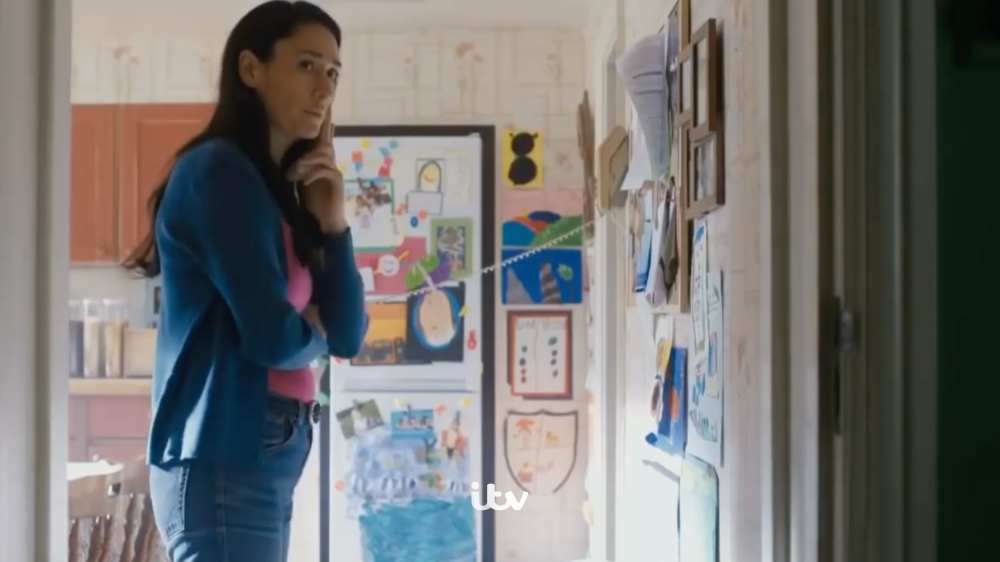
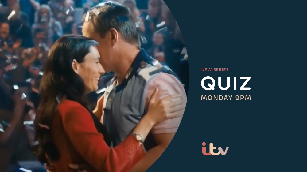
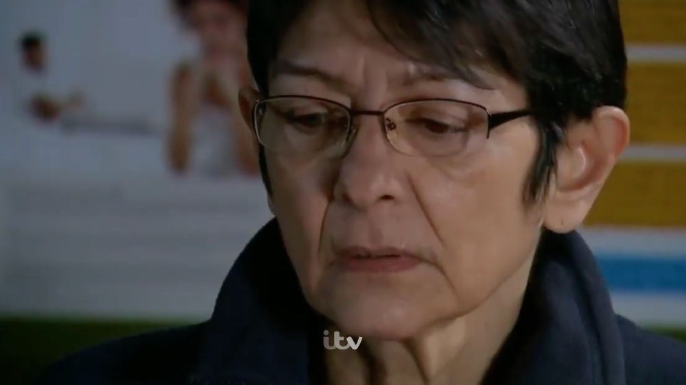
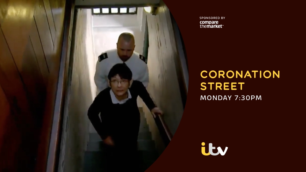
Thanks again for the replies. So I thought I'd take a stab at on-screen presentation, starting with ITV as I wanted to move away from the idea the monochrome static logo would be seen this way on the TV. I really love the colour adapting scheme introduced in 2013 and would bring it back.
Here are first of all a few promos showing the sort of idea I had in mind:
Trailer 1:
Trailer 2:
Trailer 3:
So the idea would be the promo style is consistent but yet you never get the same coloured promo twice. They are all unique and dependent on the video in the promo.
I would love to hear feedback on these and any suggestions of other things I could try (was going to give the ECP a go next).