A logo is probably the most important graphic design application you’ll have to learn as a designer.
In addition to being a crucial element for branding and visual identity, logos also teach you a TON of valuable graphic design skills, such as design principles, process systematization, and creativity.
First, you need to understand the theory and principles of logo design.
Second, you need to understand the different parts that constitute a logo.
MY NEW ONLINE COURSE
Thinking Like a Designer
Learn my proven method to finally understand the rules of any design and jumpstart your path to become an effective graphic designer

What are the different parts of a logo?
In its most basic, the parts of a logo must include a brand name and a graphic representation, such as an icon, that somehow identifies or visually highlights that brand. A logo may include the following elements:
- The logotype, wordmark, or brand name
- The icon, mark, or symbol
- The tagline or slogan (optional or contextual)
You may or may not use all these components on a given logo.
But here’s the thing:
By understanding the basic parts of a logo and their purpose, you will be able to create logos that are meaningful, structured, and effective.
Below, I explain in detail the different parts of a logo and show some great examples.
Let’s start.
Parts of a Logo
1. Logotype or Letterform
Every brand has a name.
Therefore, most logos incorporate that name within the logo design itself.
Sometimes, the name itself is the entire logo, such as Coca Cola, Google, or Disney.
This is called a logotype.
What is a logotype? A logotype is a brand name that is displayed in a strategically chosen typography or specially crafted lettering that serves as an identity for that brand.
A logotype incorporates shaped or stylized letterforms to convey meaning by only displaying a name.
That is:
These names are not merely displayed in a common font like, say, Times New Roman. They are displayed in a special way, with specially designed type that helps to convey the essence or an aspect of the brand.
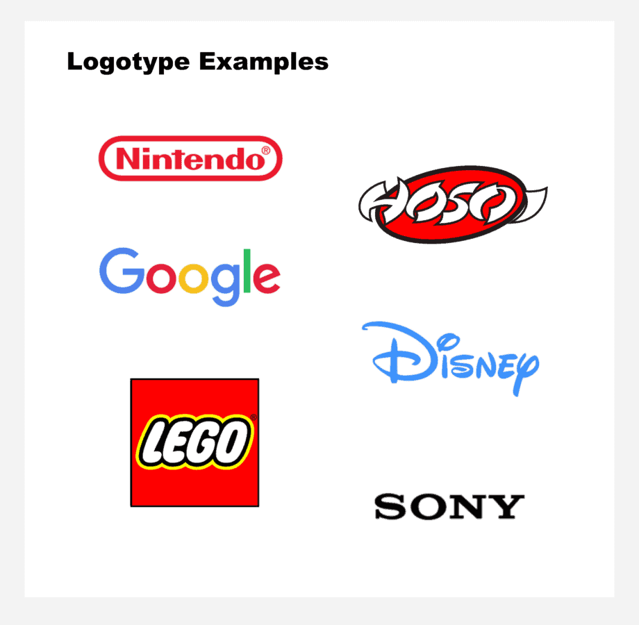
There are many famous examples of logotypes, such as Lego, Google, and Sony.
Here are some real-world logotype examples:
The logotype may incorporate other logo components, such as color, or accompany other elements, such as an icon or mark.
Here’s the gist about a logotype:
The way you display a brand name, such as the font you choose or the lettering you design, must somehow “speak” about the essence of the brand and communicate its identity.
2. Icon or Mark
One of the most common parts of a logo is the icon, mark, or symbol.
What is an icon?
An icon is a graphic representation that is able to effectively capture the essential features of some object, thing,or idea with the least amount of detail or elements.
You’ve seen them before: it’s the little drawing that accompanies many famous logos, such as Airbnb, Target, or Adidas:
Now, and this is important:
Icons are not drawings or illustrations. Their purpose is not to show a detailed rendering of a dog, tree, or house.
Their purpose is to represent, in the most minimal yet accurate way, what something is.
One of the most important principles of logo design is simplicity. In this sense, the icon or mark on a logo should be as simple as possible.
Nonetheless, it should be able to represent that for which it stands with precision.
For example:
A painting is able to incorporate as much detail as possible in order to communicate its subject. Logos, however, don’t have that luxury.
Instead, logos must pack a lot of meaning with only a few visual cues.
This is why logos mostly rely on icons or marks for communicating an identity, concept, or idea.
Logos use icons in a strategic way to communicate what a product or brand is about (its “essence”).
3. Tagline
A final, but not mandatory, component of a logo is the tagline.
What is a logo tagline?
A logo tagline serves to reinforce, explain, clarify or expand a brand’s purpose, nature, or utility in a world saturated with brands.
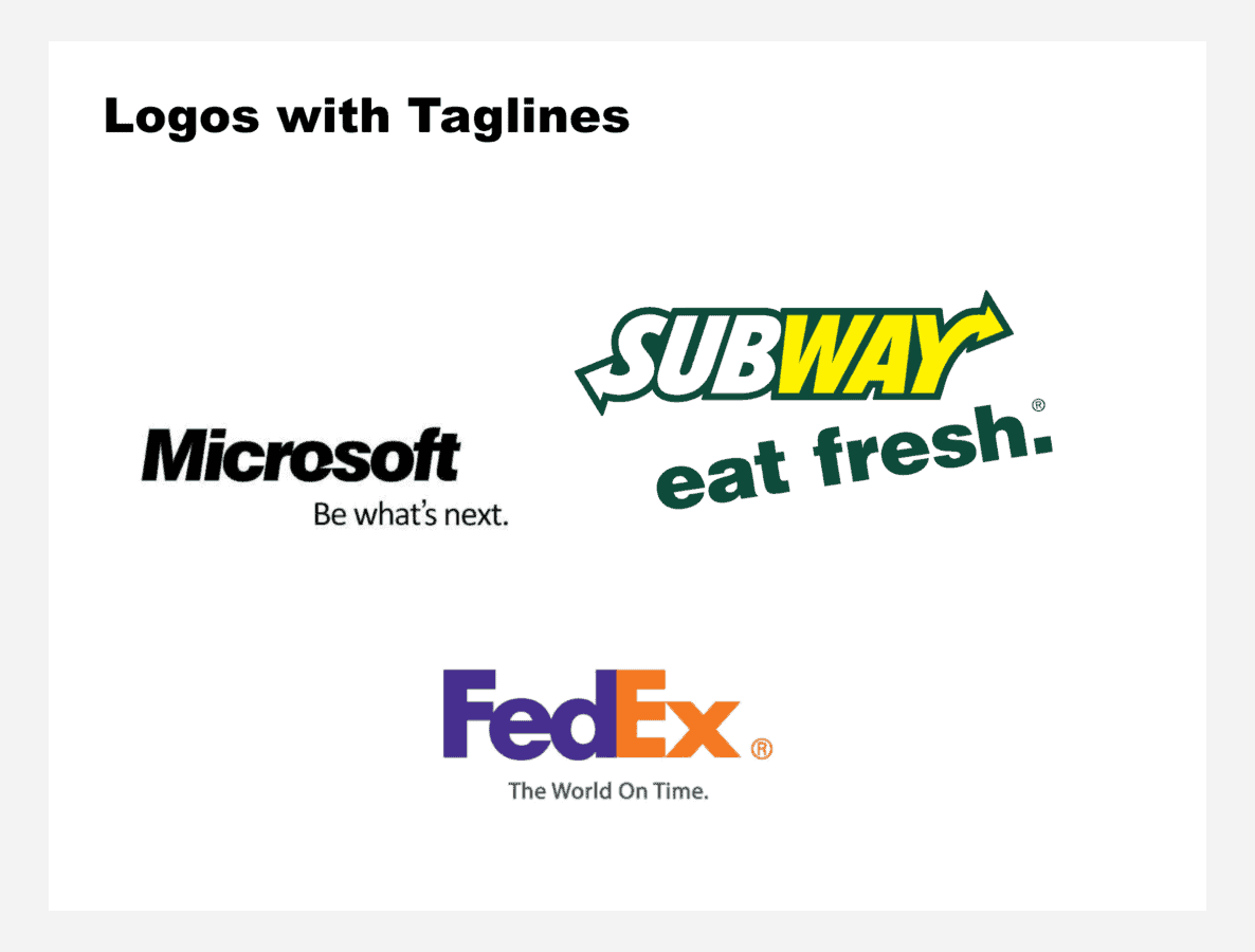
Some famous taglines are Subway’s “Eat fresh”, Nike’s “Just do it”, or McDonald’s “I’m lovin’ it.”
BONUS: Logo Elements to Consider
Shape
A logo is able to communicate not only in terms of the shapes it includes, but also in terms of the general form it conveys.
Logos are created with different general shapes: circles, squares, rectangles, triangles or even “organic” or “expressive” shapes (forms that are irregular).
Some even describe a psychology of logo shapes that contribute to how logos communicate and are perceived.
However, the importance of shapes in logos has a lot to do with practical considerations:
The form of a logo in many ways determines where and how a logo will be displayed or how its content is organized and its elements arranged.
In other words:
The totality (gestalt) of a logo has an overall shape that not only serves as a communication device but also determines how and where a logo is displayed.
Color
Logos use color as a powerful communication device. You’ve probably heard that there’s actually a psychology of color, with many theories pointing to the different effects of color.
While this may actually be true, color also serves a more practical communicative purpose in logo design:
As humans living inside a given society, we associate certain meanings with certain colors in culturally specific ways. These associations may vary from culture to culture.
For example:
Western cultures associate the color yellow with caution.
This idea is reinforced by traffic lights, which use yellow for communicating “slow down,” or workers’ hard hats, which tend to be yellow. Red reinforces the idea of heat, hence the intense red used in fire trucks.
Some other color associations come from advertising and the media.
While we logically associate the color green with nature, in the past decade the marketing of “green” products and practices has contributed to the association of the color green with the concept of “environmental consciousness.”
This is exemplified by British Petroleum’s logo remake, in which the strategic use of green serves to produce the effect of “environmentally conscious.”
Analogy
A visual analogy is the communicative force behind a logo. A powerful analogy helps us remember a logo with interest and curiosity.
What is a visual analogy in logo design?
A visual analogy is a way of combining visual attributes that are inherently different in a new way that makes sense, in a funny, interesting, creative, or dramatic fashion.
For example, through visual analogies, we are able to make connections between an aspect of a brand name and some literal or abstract attribute that connects with a dimension of the brand.
In the next example, the “P” of the brand name “Pencil” can be manipulated in a special way to represent what the name stands for in an iconic way:
Here are more examples:
Ideally, we would try to incorporate a visual analogy to every logo as a way to achieve memorability and uniqueness.
Conclusion: Logo Anatomy Will Help You Learn Logo Design
Logos are the most important aspect of a brand identity.
As author Robin Landa says, “a logo is the single graphic design application that will be a part of every other brand design application”.
By understanding the different parts or components of a logo, you will be able to understand how logos are created and how they communicate effectively.
Remember, at its most basic, a logo has the following components:
- Brand name, wordmark, or logotype
- An icon, mark, or some other form of representation
- Occasionally, a tagline
As you continue to understand how logos are created, you will also learn to apply design principles and creative communication skills, such as communication through visual analogies.
Keep on working!
MY NEW ONLINE COURSE
Thinking Like a Designer
Learn my proven method to finally understand the rules of any design and jumpstart your path to become an effective graphic designer

About the Author:
Ruben Ramirez teaches digital media in college and started Self-Made Designer to share his knowledge of graphic design. He is also a self-taught designer.